

Berkadia, a top U.S. Commercial Real Estate firm, serves two distinct teams—Mortgage Bankers and Investment Sales Advisors—both relying on Salesforce for critical deal data. Their legacy Account Page forced a one-size-fits-all experience, creating bottlenecks and slowing workflows. As Lead Product Designer, I spearheaded a redesign that delivered a tailored, streamlined interface—cutting friction and powering faster, smarter decisions without disrupting existing processes.
We started by addressing clear pain points—removing redundant sections and reorganizing content—guided by insights from experienced users and stakeholders. Even before formal research, these quick wins reduced page length by 48%, making the interface cleaner and much easier to navigate.
To validate these quick fixes, I held impromptu chats, calls, and emails with over 150 Advisors and Lenders. Their feedback confirmed the value of these changes, and their positive response also helped generate buy-in for the broader redesign effort.
After those early wins helped secure stakeholder buy-in, we interviewed 20 users—half Advisors, half Lenders—to map out their Salesforce Account workflows. We validated some assumptions and uncovered clear gaps in data integration, visualization, and task efficiency. We synthesized interview feedback to surface common themes, which directly informed design decisions and kept the redesign grounded in real user needs.
We learned that Advisors and Lenders required rapid access to critical insights. To accelerate development, we leveraged Salesforce’s native charts and components. Our iterative approach ensured incremental value without disrupting existing workflows.
As we streamlined the Details page, we introduced the Metrics tab—a default view composed of three subtabs, with the Overview subtab serving as the primary entry point. Here, advisors gain instant visibility into deal volume and producer activity.
This reduces tab-hopping and lengthy field scans by providing a fast, visual snapshot of transactions, property breakdowns, account teams, and key contacts. This shift advanced a more intuitive, insight-driven user experience.
The Transactions tab is one of three new subtabs under Metrics, designed to surface key insights efficiently. It addresses a top user need by providing a clear, accessible view of deal history—when deals occurred, who was involved—through a full-width table and supporting charts spotlighting top producers and key property information.
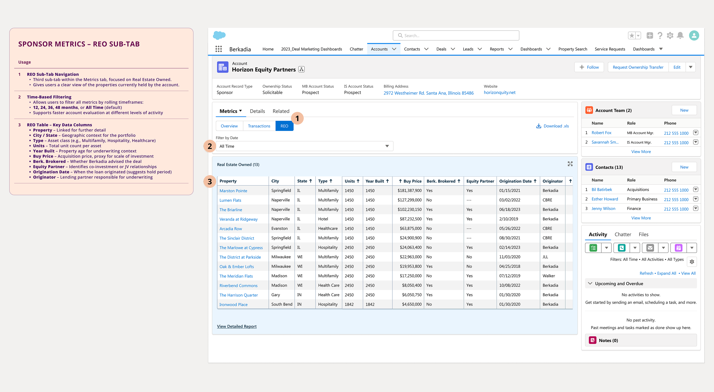
Users consistently needed clear visibility into which properties an account owns and where they’re located. The REO tab addresses this by highlighting assets across geography, property type, and size. This feature enables users to quickly assess portfolio strength, identify gaps, and tailor their outreach more effectively.
We redesigned the Sponsor Account experience to do one thing really well: help users get to what matters, faster. Within two months of launch, Salesforce analytics showed a 38% increase in account page retention and a 24% drop in bounce rate—clear signs that users were finding value, faster.